
In the age of big data, many businesses find themselves drowning in information yet starved for wisdom. This is the paradox of the 'data graveyard', where vast quantities of collected data lie dormant, failing to drive strategic action. The solution isn't more data; it's better synthesis. Data dashboards serve as this crucial bridge, transforming raw, complex datasets into a clear, visual narrative that guides decision-making. An effective dashboard does more than just display charts; it tells a story, highlights critical trends, and surfaces the key performance indicators that matter most.
This article moves beyond abstract advice by dissecting 7 real-world data dashboard examples. We will analyze the specific design choices, metric selections, and strategic layouts that make each one effective. For every example, you'll find screenshots, direct links, and actionable takeaways you can apply directly to your own projects. We’ll explore what makes a dashboard not just informative but truly instrumental in achieving business goals. To reinforce the impact of well-designed dashboards, exploring various examples can provide valuable insight. You can find more 8 actionable marketing dashboard examples that focus specifically on campaign performance and ROI. Let's explore how to turn your data into your most powerful strategic asset.
1. Tableau Public – Dashboard Examples
Tableau Public isn't just a platform; it's a vast, living library of data dashboard examples, making it an essential starting point for anyone seeking inspiration or technical guidance. It serves as a community-driven gallery where creators from various industries-including business, healthcare, and sports-publish their interactive visualizations. This makes it an unparalleled resource for seeing real-world data storytelling in action.
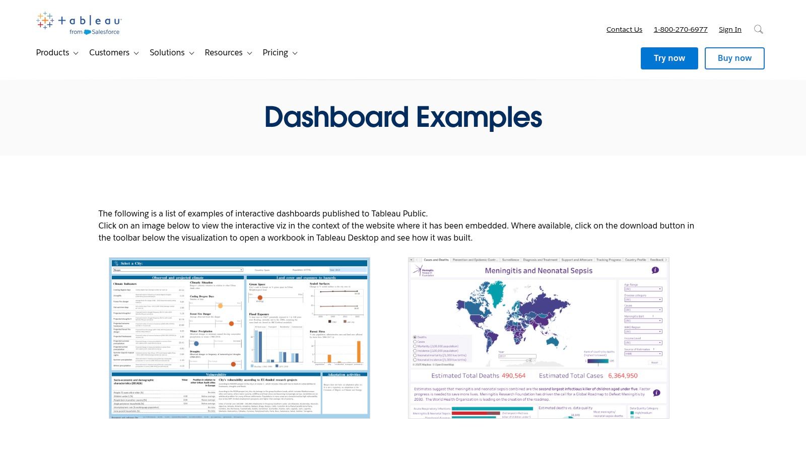
What truly sets Tableau Public apart is its hands-on learning approach. Unlike static image galleries, many dashboards are fully interactive, allowing you to click, filter, and explore the data firsthand. Even better, a significant number of creators allow you to download their entire workbook. This unique "look-under-the-hood" feature lets you reverse-engineer complex charts and calculations, providing a masterclass in dashboard construction.
Strategic Analysis & Key Features
Tableau Public's strength lies in its community and curation. The "Viz of the Day" feature highlights exceptional work, ensuring you're always seeing fresh, high-quality examples of what's possible.
- Access Requirements: The platform is completely free to browse, with no paywall or sign-up required to view the dashboards. To download and edit workbooks, you will need either the free Tableau Public Desktop edition or a paid version of Tableau Desktop.
- Unique Offerings: Its most powerful feature is the downloadable workbook functionality, which is invaluable for learning advanced techniques and adapting proven designs for your own projects.
- User Experience: The interface is clean and searchable. You can filter examples by category, featured authors, or trending topics, making it easy to find relevant dashboards.
Actionable Takeaways
To maximize your use of this resource, focus on reverse-engineering. When you find a dashboard you admire, download the workbook and deconstruct its components. Pay close attention to the calculated fields, filter actions, and layout containers used. This hands-on analysis is one of the fastest ways to elevate your own dashboarding skills and foster a culture of data-driven decision-making within your team. Don't just look for inspiration; look for replicable mechanics.
Official Website: Tableau Public Dashboard Examples Gallery
2. Google Looker Studio – Report Gallery
For teams deeply integrated with the Google ecosystem, the Google Looker Studio Report Gallery is an indispensable resource. It’s less of a community free-for-all and more of a curated collection of data dashboard examples and templates, specifically optimized for sources like Google Analytics, Google Ads, and BigQuery. The gallery serves as a launchpad, offering polished, ready-to-use reports for marketing, SEO, and e-commerce analysis.
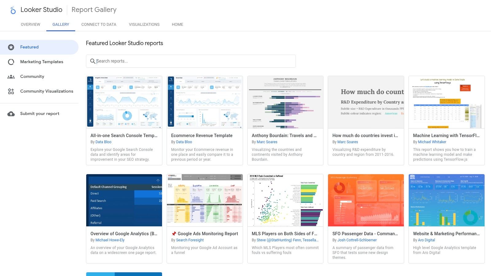
The primary differentiator for Looker Studio's gallery is its immediate utility. While other platforms focus on inspiration, Looker Studio prioritizes action. With a single click, you can copy a template and connect it to your own data sources, generating a functional, professional-grade dashboard in minutes. This plug-and-play approach dramatically lowers the barrier to entry for creating powerful, integrated marketing and web analytics reports.
Strategic Analysis & Key Features
Looker Studio’s strength is its seamless integration and speed-to-value for marketing professionals. The gallery leverages its native connection to Google products to provide templates that work out of the box with minimal configuration.
- Access Requirements: The gallery and all Google-made templates are completely free to use with a standard Google account. Some community-submitted dashboards may require paid third-party connectors to access non-Google data sources.
- Unique Offerings: The one-click "Use template" functionality is its standout feature. It allows users to bypass the complex setup phase and move directly to analysis, making it exceptionally efficient for common use cases like GA4 traffic reports or Google Ads performance dashboards.
- User Experience: The gallery is clean and straightforward. Dashboards are categorized, and each listing clearly shows the required data connectors. While the third-party submissions can vary in quality, the Google-authored templates are consistently high-quality and well-documented.
Actionable Takeaways
Leverage the gallery for rapid prototyping and standardization. Instead of building core marketing reports from scratch, start with a gallery template. Use it to establish a baseline and then customize it by adding your specific business metrics or branding. This approach saves significant development time and ensures your team is starting with a dashboard built on proven best practices for visualizing Google-centric data. Focus on adapting, not just adopting.
Official Website: Google Looker Studio Report Gallery
3. Microsoft AppSource – Power BI Apps and Templates
Microsoft AppSource is less a gallery and more a strategic marketplace for accelerating dashboard deployment within the Power BI ecosystem. It offers a rich catalog of pre-built "template apps" that come bundled with dashboards, reports, and data models for specific business applications like Salesforce Analytics, Microsoft 365 Usage, or Google Analytics. This makes it an excellent source of data dashboard examples designed for rapid, enterprise-level implementation.
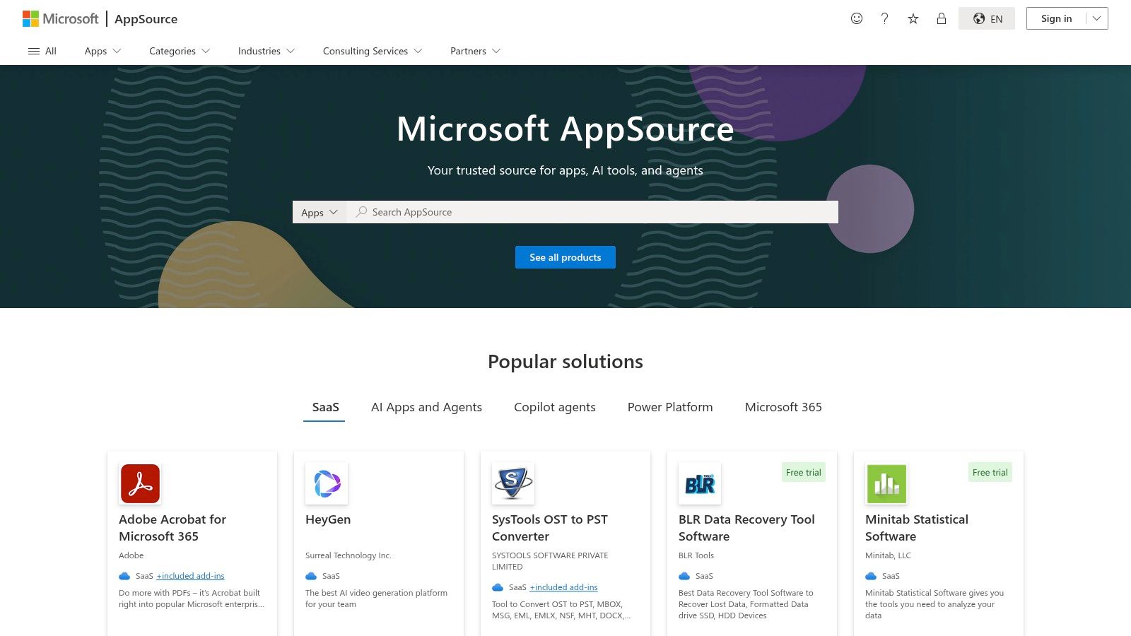
Unlike open galleries focused on individual creativity, AppSource emphasizes turnkey solutions. These apps connect directly to your company’s data sources, populating professionally designed dashboards in minutes rather than weeks. This approach allows businesses to leverage best-practice layouts and key performance indicators (KPIs) developed by Microsoft and third-party experts, bypassing much of the initial design and development work.
Strategic Analysis & Key Features
AppSource's core strength lies in its deep integration with the Microsoft Power Platform, providing a secure and governed way to distribute analytics across an organization. It's built for scale and standardization.
- Access Requirements: Browsing AppSource is free, but installing and using most organizational apps requires a Power BI Pro or Premium license. Many apps offer a free trial or are free to install, but may have associated service costs.
- Unique Offerings: The template app functionality is its key differentiator. Instead of just an image, you get a fully functional, data-connected dashboard package ready for deployment. The marketplace also includes a vast library of certified custom visuals to extend Power BI's native charting capabilities.
- User Experience: The platform is searchable and filterable, allowing users to find apps by category (e.g., finance, marketing) or publisher. Each listing includes screenshots, a detailed description, and user reviews, helping you evaluate the solution before installation.
Actionable Takeaways
Use AppSource as a launchpad, not just a finished product. Install a template app relevant to your business needs (like marketing or sales analytics) and study its underlying data model and DAX measures. This provides a professional blueprint for structuring your own data and calculations. Analyze how the pre-built reports are organized and which KPIs are prioritized to gain insights into industry-standard reporting practices. This method accelerates learning and ensures your custom-built dashboards are grounded in proven designs.
Official Website: Microsoft AppSource
4. Qlik – Dashboard Examples (by Role/Industry)
Qlik offers a highly structured and educational gallery of data dashboard examples tailored to specific business roles and industries. Unlike open-ended community platforms, Qlik's collection is curated to solve specific business problems, making it a powerful resource for stakeholders who need to see the direct application of data in their domain, whether it's finance, marketing, or supply chain.
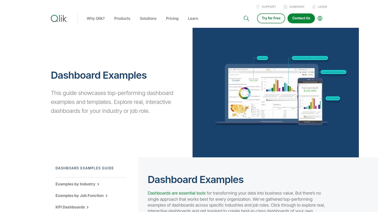
The platform excels at demonstrating practical KPI dashboards and explaining the "why" behind each visualization. Each example is interactive, showcasing Qlik's associative engine, which allows users to make selections anywhere and see all related data instantly update. This provides a clear demonstration of how dynamic exploration can uncover hidden insights that static reports often miss, serving as both inspiration and an effective sales tool for the Qlik ecosystem.
Strategic Analysis & Key Features
Qlik's strength is its role-based learning approach. It directly connects dashboard design to business value by organizing examples around job functions like CFO or Sales Manager, making the benefits tangible for non-technical users.
- Access Requirements: The example gallery is completely free to browse and interact with. To build or customize these dashboards, you would need to sign up for a Qlik Sense trial or a paid subscription.
- Unique Offerings: The most distinct feature is its organization by business role and industry, complete with explanations of relevant KPIs. This is ideal for educating teams on which metrics matter and how to visualize them effectively.
- User Experience: The website is clean, with intuitive navigation that lets you quickly filter for relevant examples. Each dashboard is presented within a guided experience that explains its purpose and features.
Actionable Takeaways
Use Qlik’s gallery as an educational tool for your stakeholders. If you're pitching a new sales dashboard, start with their pre-built sales example to establish a common language and demonstrate what’s possible. Focus on how their associative exploration allows for deeper questioning. This approach helps align teams and can streamline requirements gathering for new projects. It also highlights how effective dashboards can be a key component in successful business process automation.
Official Website: Qlik Dashboard Examples
5. Databox – Dashboard Examples & Templates
Databox shifts the focus from building dashboards from scratch to deploying them rapidly. It offers a massive library of over 300 pre-built, plug-and-play data dashboard examples and templates tailored for specific business functions like marketing, sales, finance, and SaaS management. This approach is ideal for teams that need to get insights quickly without a lengthy development cycle.
The platform's core value is its seamless integration with over 130 popular data sources, including Google Analytics 4, HubSpot, and Salesforce. Instead of just providing visual inspiration, Databox allows you to select a template, connect your data source with a few clicks, and instantly populate the dashboard with your own live metrics. This makes it a powerful tool for operationalizing data analytics across an organization with minimal technical overhead.
Strategic Analysis & Key Features
Databox excels at speed and accessibility, making it a go-to for business users, not just data analysts. Its template library is its strongest asset, providing proven layouts and key performance indicator (KPI) selections for virtually any standard business report.
- Access Requirements: While browsing the examples is free, a paid subscription is required to connect your data and use the templates. Databox offers a 14-day free trial for users to test its full capabilities before committing.
- Unique Offerings: The key differentiator is the "one-click" template deployment. You can go from a static example to a fully functional, live dashboard connected to your company's data in minutes. Features like goal setting and performance benchmarking are also built directly into the dashboards.
- User Experience: The interface is clean, with a guided workflow that makes connecting data sources and customizing templates straightforward. Dashboards are organized by integration (e.g., GA4 dashboards) or business function (e.g., sales dashboards), simplifying the discovery process.
Actionable Takeaways
Use Databox for rapid prototyping and standardization. Instead of debating KPI selection and layout for common reports, browse the template library to find a best-practice starting point. Select a template for a core function, like a "Monthly Marketing Report," connect your data, and use it as a baseline. From there, you can customize it by adding or removing metrics to better fit your team's specific objectives. This approach saves countless hours and aligns your team around industry-standard reporting formats.
Official Website: Databox Dashboard Examples
6. Geckoboard – Real-Company Dashboard Examples Library
Geckoboard’s example library focuses on a different, yet equally vital, aspect of data visualization: operational clarity. Instead of showcasing complex analytical deep dives, its collection of over 70 data dashboard examples is modeled on how real teams monitor live Key Performance Indicators (KPIs). It offers a masterclass in designing dashboards for at-a-glance comprehension, making it an ideal resource for teams in Sales, Marketing, Support, and Operations.
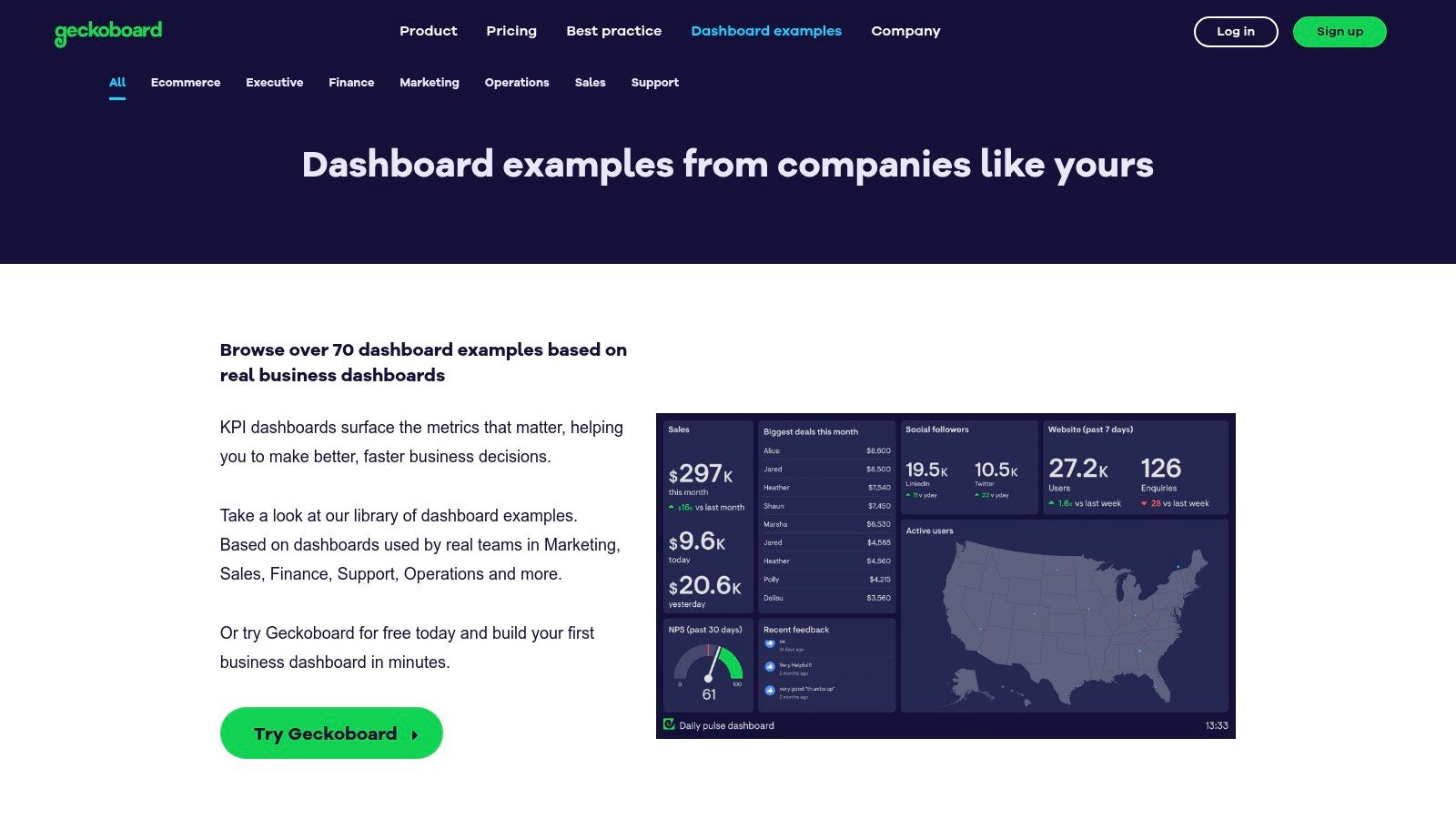
What makes Geckoboard's library unique is its sharp focus on simplicity and immediate utility, often for display on large TV screens in an office. The designs prioritize clean, uncluttered visuals that communicate status instantly. This approach is less about exploratory analysis and more about providing a shared, real-time pulse of business activity to keep entire teams aligned and motivated.
Strategic Analysis & Key Features
Geckoboard excels at translating business metrics into easily digestible visuals for non-technical users. Its library demonstrates how to build dashboards that don't require interpretation, making them perfect for fast-paced operational environments.
- Access Requirements: The example library is completely free to browse. To build and connect your own data sources, Geckoboard offers various paid subscription plans, with some integrations and higher data usage locked behind higher tiers.
- Unique Offerings: The library’s strength is its tight integration with real-world use cases. Examples are clearly categorized by department (e.g., Sales, Marketing), providing templates that teams can implement quickly. The platform is also optimized for TV displays, with specific branding and theming options.
- User Experience: The website is straightforward and easy to navigate. Each example comes with a clear explanation of the KPIs being tracked and why they matter, alongside how-to guides for building similar dashboards from common tools like spreadsheets.
Actionable Takeaways
Use Geckoboard's library to learn the art of KPI selection and minimalist design. When browsing the examples, don't just look at the charts; analyze the choice of metrics for each department. Ask yourself: "Which 5-7 numbers provide 80% of the operational story for this team?" This exercise helps you cut through the noise and build dashboards that drive action, not analysis paralysis. Focus on creating a single source of truth for your team’s most critical, real-time goals.
Official Website: Geckoboard Dashboard Examples
7. Creative Tim – Admin & Dashboard Template Marketplace
Creative Tim isn't a gallery of completed projects but a powerful marketplace for developers seeking a head start. It offers premium front-end admin and dashboard UI kits built on popular frameworks like Bootstrap, React, Vue, and Angular. This makes it an essential resource for teams that need to build custom, production-ready data dashboard examples from the ground up without starting from a blank slate.
What differentiates Creative Tim is its focus on high-quality, pre-built components and layouts. Instead of just offering visual inspiration, it provides the actual code that developers can use to accelerate their workflow. Each template comes with multiple dashboard layouts, dozens of components, and example pages, serving as a functional blueprint for building sophisticated and visually appealing data interfaces.
Strategic Analysis & Key Features
Creative Tim’s strength lies in its blend of professional design and developer-friendly implementation. It bridges the gap between a design concept and a functional front-end, saving countless hours of development time.
- Access Requirements: Templates are available via a one-time purchase, with clear licensing for personal and commercial projects. Free versions are also available for many templates, offering a great way to test the quality before committing.
- Unique Offerings: The platform provides comprehensive live demos for every template, allowing you to interact with all the components and pages before purchasing. This hands-on preview is critical for ensuring the kit meets your project’s specific needs.
- User Experience: The website is well-organized, with clear documentation and support for each product. You can easily filter templates by framework, making it simple to find a kit that matches your team's tech stack.
Actionable Takeaways
To leverage Creative Tim effectively, treat it as an accelerator, not just a template. Before purchasing, thoroughly explore the live demos to identify a template whose components and layout philosophy align with your data story. Once you have the code, encourage your team to customize it deeply rather than using it as-is. This approach helps maintain a unique brand identity while still benefiting from the foundational development work. It’s a strategy that mirrors the efficiency gains found in low-code platforms, helping you unleash innovation faster.
Official Website: Creative Tim Admin & Dashboard Templates
Dashboard Examples Comparison of Top 7 Platforms
| Solution | Implementation Complexity 🔄 | Resource Requirements ⚡ | Expected Outcomes 📊 | Ideal Use Cases 💡 | Key Advantages ⭐ |
|---|---|---|---|---|---|
| Tableau Public – Dashboard Examples | Moderate – requires Tableau Desktop/Public for edits | Low – free access, software needed for editing | Diverse interactive dashboards, inspiration and learning | Visual learning, benchmarking, idea generation | Large community, free access, rich interactivity |
| Google Looker Studio – Report Gallery | Low – one-click template use | Low – Google account, possible paid connectors | Quick, marketing-focused reports | Marketing, web analytics, fast report setup | Easy data connection, free with Google account |
| Microsoft AppSource – Power BI Apps/Templates | Moderate – Power BI Pro/Premium often required | Medium – licensing costs, app setup varies | Enterprise-grade analytics apps, certified visuals | Enterprise BI, fast deployment in Microsoft ecosystem | Large certified library, governance integration |
| Qlik – Dashboard Examples (by Role/Industry) | Moderate – rebuild dashboards in Qlik needed | Medium – Qlik software, some paid features | Role-based KPI dashboards and stakeholder education | Industry/role-specific insights, design inspiration | Guided KPI examples, free to browse |
| Databox – Dashboard Examples & Templates | Low – fast deployment with templates | Medium – subscription required after trial | Ready-to-use, connected dashboards for marketing and sales | Plug-and-play dashboards, multi-source integration | Fast setup, broad template coverage |
| Geckoboard – Real-Company Dashboard Examples | Low – simple KPI monitoring dashboards | Low-Medium – subscription tiers for integrations | Clear, at-a-glance operational KPI monitoring | Operational KPIs, team TV display | Uncluttered visuals, easy for non-BI users |
| Creative Tim – Admin & Dashboard Templates | High – front-end UI kits require custom backend setup | Medium-High – purchase cost, developer resources | Production-ready UI templates for custom dashboard building | Developers building dashboards from scratch | High design quality, multi-framework support |
Your Blueprint for Building Dashboards That Drive Action
We've journeyed through a diverse landscape of data dashboard examples, from the intricate public visualizations on Tableau to the practical, real-time monitors offered by Geckoboard. Across these powerful platforms, a clear pattern emerges: the most effective dashboards are not just data displays, they are strategic communication tools meticulously designed for a specific purpose and audience.
The examples from Google Looker Studio and Microsoft Power BI showcase the immense value of ecosystem integration, where dashboards seamlessly pull data from the tools your team already uses. Meanwhile, resources like Databox and Creative Tim prove you don't need to start from scratch. Templates provide a powerful launchpad, allowing you to focus on adapting a proven structure to your unique business logic rather than reinventing the wheel.
Your Actionable Checklist for Dashboard Success
Distilling the insights from these examples gives us a repeatable blueprint for success. Before you build your next dashboard, use this four-step checklist to guide your process and ensure you create a tool that informs, persuades, and drives tangible outcomes.
- Define Your Audience and Use Case First: The fundamental difference between a public-facing Tableau deep-dive and a private Geckoboard KPI tracker is the audience. Ask yourself: Who is this for? What single question must it answer? A dashboard for a C-suite executive should be high-level and strategic, while one for a marketing team needs granular, tactical metrics.
- Steal Like an Artist (and Reverse-Engineer): The galleries we've explored are your greatest resource. Find a dashboard that resonates with your goal and break it down. What story is it telling? How does the visual hierarchy guide your eye? Replicating the logic behind a great design is far more effective than copying its colors.
- Prioritize Clarity Over Complexity: The most common dashboard mistake is trying to show everything at once. A cluttered interface creates confusion, not clarity. Each chart, metric, and filter should have a clear purpose. If a visual element doesn't directly contribute to answering the dashboard's core question, remove it. To see how these principles apply in practice for specific domains, consider examples like these on essential product analytics dashboards.
- Automate Data Flow for Real-Time Relevance: A dashboard is only as valuable as the data it displays. Stale data leads to poor decisions and erodes user trust. Prioritize setting up robust, automated data pipelines to ensure the information is always fresh, reliable, and ready for analysis.
Ultimately, a great dashboard is not a one-time project; it's an evolving product. It requires iteration, user feedback, and a commitment to refinement. The best data dashboard examples are living documents that grow with the business. Start small, gather feedback from your stakeholders, and continuously improve. Your goal isn't just to build a dashboard; it's to build a more data-informed culture, one clear insight at a time.
Ready to build dashboards that drive decisions but held back by data challenges? Zilo AI provides the high-quality data annotation, preparation, and skilled human-in-the-loop services needed to fuel your analytics engine. Let our expert teams handle the foundational data work so you can focus on extracting insights and achieving business growth.